
Title : Dr.Moon’s dental clinic
Program : Healthcare
Location : Dangju-dong, Jongno-gu, Seoul, Korea
Total floor area: 34.32 m²
Design Period: 2004. 12. 01 ~ 2004. 12. 20
Construction Period: 2004. 12. 24 ~ 2005. 01. 11
Minimum
“The minimum could be defined as the perfection that an artifact achieves when it is no longer possible to improve it by subtraction. This is the quality that an object has when every component, every detail, and every junction has been reduced or condensed to the essentials. It is the result of the omission of the inessentials.” _ John Pawson


4.3 x 8.1
This is the maximum dimension of this space.
This space measures up to 4.3m X 8.1m=34.83 m2, that is, 11.5pyung.(*pyung: Korean traditional dimensional unit. 1 pyung equal to 33m2)
I was frustrated when I was first asked to renovate this dental clinic. I wondered what I could do for this place. It was such a small space…. no extra place to budge. The clinic was located in a crowded mall area and I did not think I could make much difference…this thought was stuck in my mind.
However, after having completed the project, I realized that this project would be one of my most favorite and well completed renovations that expresses the minimalism I have been in quest after. I appreciate my client for keeping his faith in my interpretation of the project.
I was thus able to breathe life into the space.

Through dramatic contrast,
giving life into the small space
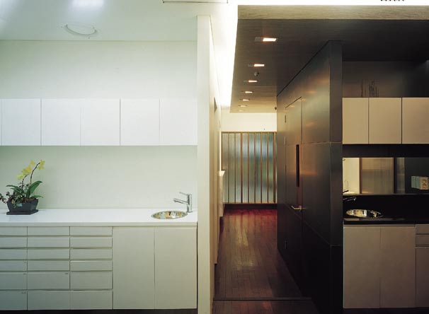
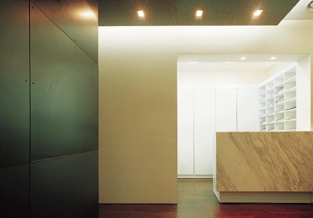
The background is a white space that accepts everything. Within
this space, the dentist office takes place as the “yang mass” and the nurse’s space digs into this place as the “yin mass.” The instantaneous quality upgrade of the space is induced through placing natural white marble.
The dramatic contrast is brought about by the black Corten finish of the X-ray room shaped in a rectangular parallelepiped form. The X-ray room is placed in the center of the transparent exterior layer and the white space, as if it speaks of the hard space of an X-ray room.
The floor encounters the black and white extreme but melts them altogether through the red wooden material that symbolizes the earth from nature. The white space, which becomes the backdrop, holds this black mass. The white backdrop, black core, the red flood symbolizing the earth, …and they all dramatically meet the quaint white washed walnut ceiling.
The waiting room and the clinic is connected by the wood ceiling, which grabs the space. This ceiling is a connective element to the divided space.

METAPHORICAL TRANSPARENCY,
EYESIGHT EXTENSION


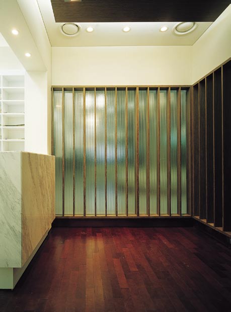
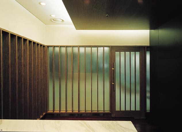
Facade
I needed to have a natural input from the exterior because it was such a limited space. The extreme measurement of the space necessitated a visual extension, and thus, I looked for a transparent material.
Glass was one of the transparent materials and there were many others. In this project, I wanted something that had transparency that could breathe in natural light; I chose polycarbonate whereby we could feel the natural movement from the exterior. The polycarbonate material is like glass as it has transparency, and it also can reflect what has transformed into “a unique texture of its own” to the exterior. This differs from glass, which exposes its silhouette, and polycarbonate brings Also, in order to lessen the excessive modern touch and somewhat lightness of the polycarbonate material, wooden frames are placed around it, thereby, giving depth and weight to the transparent wall space about a metaphorical space of its unique color. Like translucent glass, polycarbonate does not shut the exterior out from the interior.
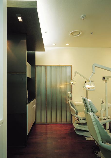

Clinic room
White space that signifies a dental clinic.
The extreme white has been pursued as if there were natural light in the underground space.
The artificial ceiling in square form becomes the center of light within this white space.
The black Corten sub-space of the clinic is an extension of the X-ray room and is a further
extension of the entire center of gravity.
Dr. Moon’s Dental Clinic LOGO Design
The Korean translation of the clinic name is “smiling dental clinic” and it is meant to symbolize the opened mouth when you say “ah…” to the dentist which becomes a “big smile” after you visit this clinic. I re-designed the former logo that was initially devised by the dentist’s friend when the clinic first opened. Now, the new logo has become a part of the “symbolic light” of the clinic.
